The product team wanted to standardize the user experience of Connect. Currently, we have given our customers the ability to change Connect’s design system to their look and feel. Although this brings added value to the customer, it does hinder our brand. Therefore, we saw this as an opportunity to give Connect a visual appearance that offers excellent aesthetics and increases end users’ trust in the product.
Main Goals
Create a new simplified design system to given connect a more trustworthy appearance.
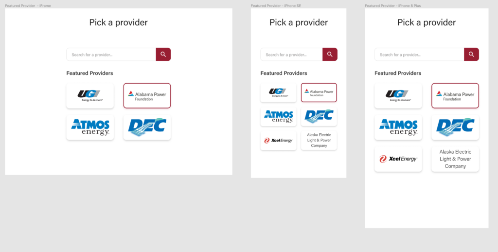
- The new design should complement the vast array of providers we support.
- It should give an increased sense of security
- The visual system should be very extensible; we want to stick to a well-known web framework and keep elements simple.
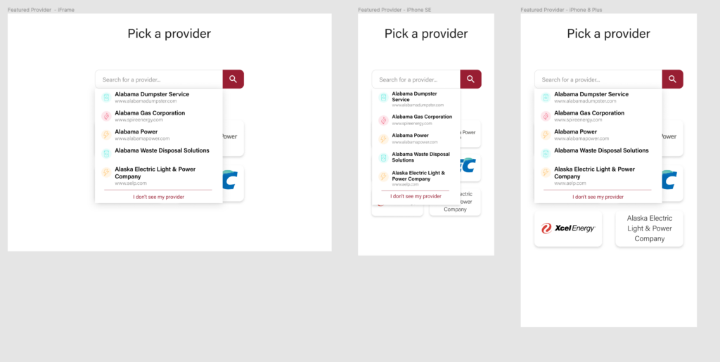
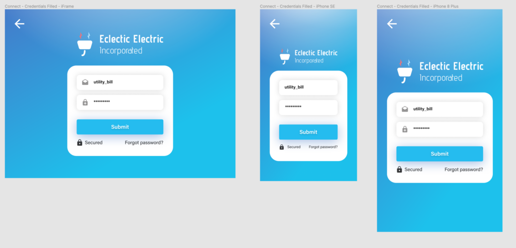
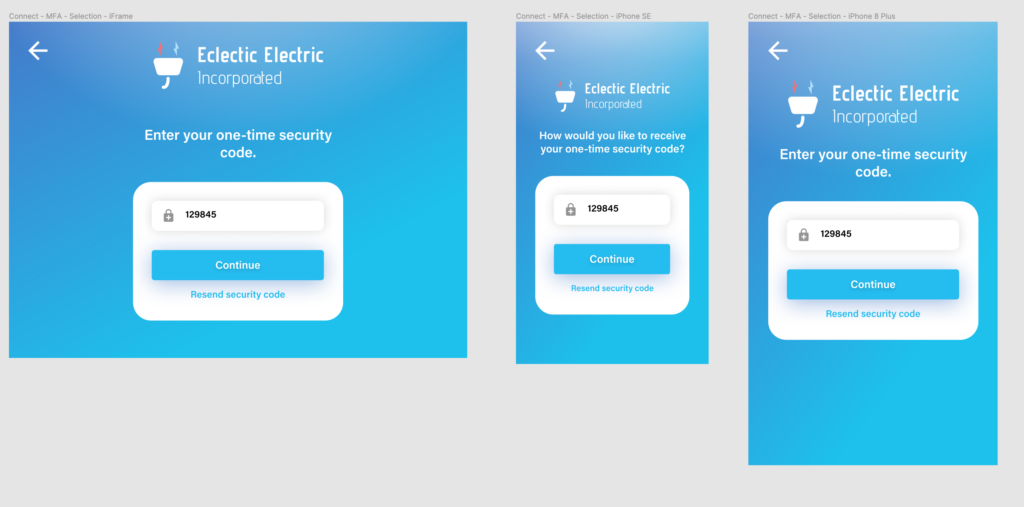
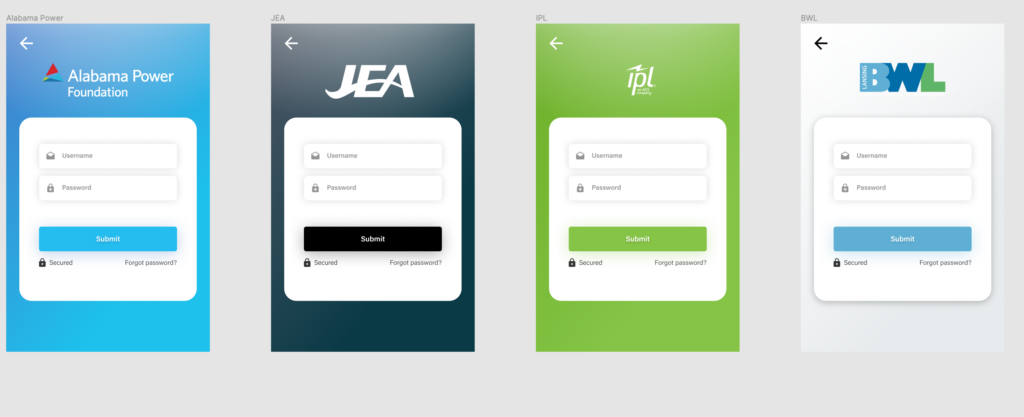
Color creates uniqueness
The UI elements are kept very simple, the brand colors of utility providers give the screen a unique appearance. As you will see below, this motif scales quite nicely.