A concise presentation
This presentation is a figma prototype; use a desktop monitor or tablet device.
The situation
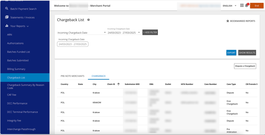
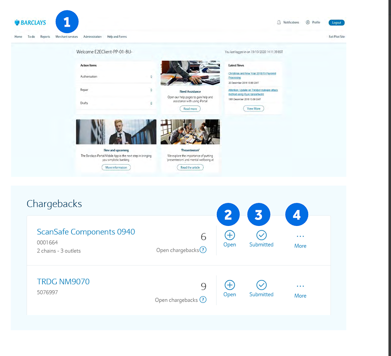
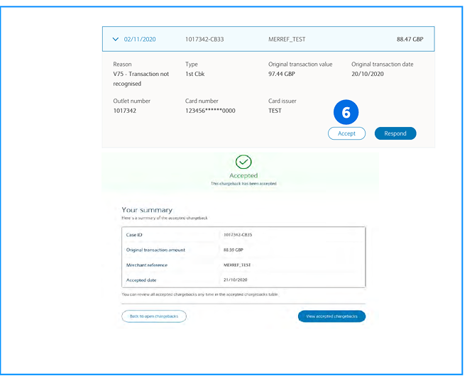
A chargeback occurs when a cardholder requests a refund from the merchant, often due to a return or suspected fraud. While large businesses manage chargebacks efficiently through dedicated teams and data exports, small merchants depend on the user interface and chargeback reports to handle disputes, making the process more challenging for them.
The problem space
Through surveys, we discovered that users find the chargeback process cumbersome and confusing. As a result, merchants are missing their window to respond to chargebacks, leading to lost revenue.
We had to ask ourselves, how might we improve chargeback submission and chargeback tracking? Could we reduce the errors and the turnaround time for merchant action/feedback
Design strategy
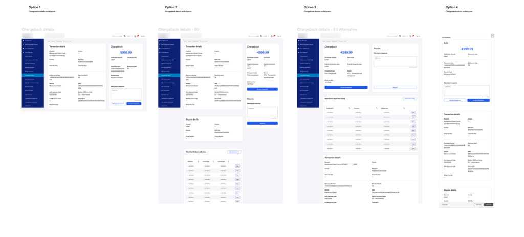
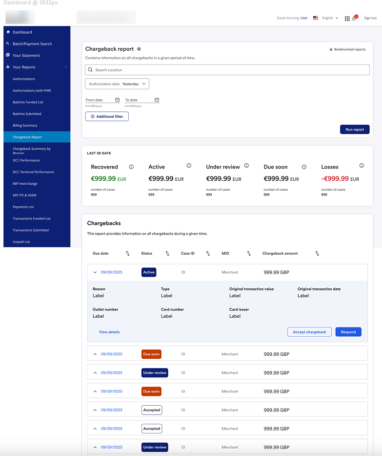
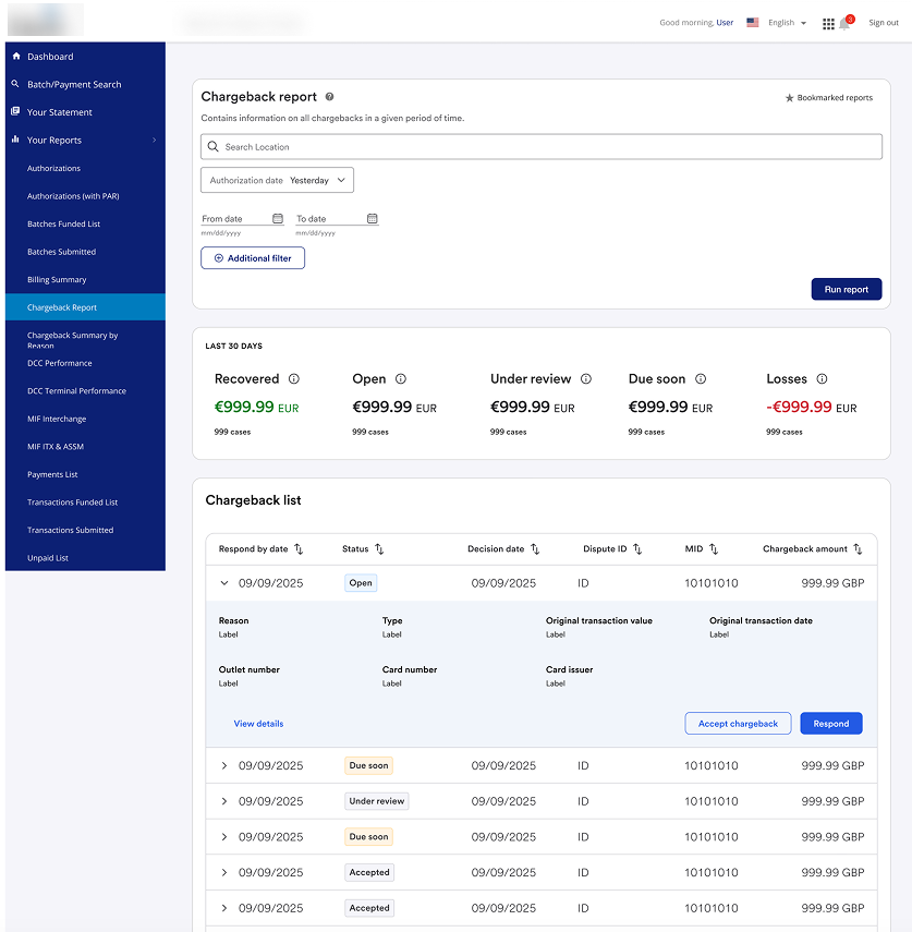
- Simplified the UI: Merged multiple tables into a single expandable nested table for a cleaner hierarchy.
- Prioritized Data: Displayed critical data points at a glance, with detail panels for secondary information.
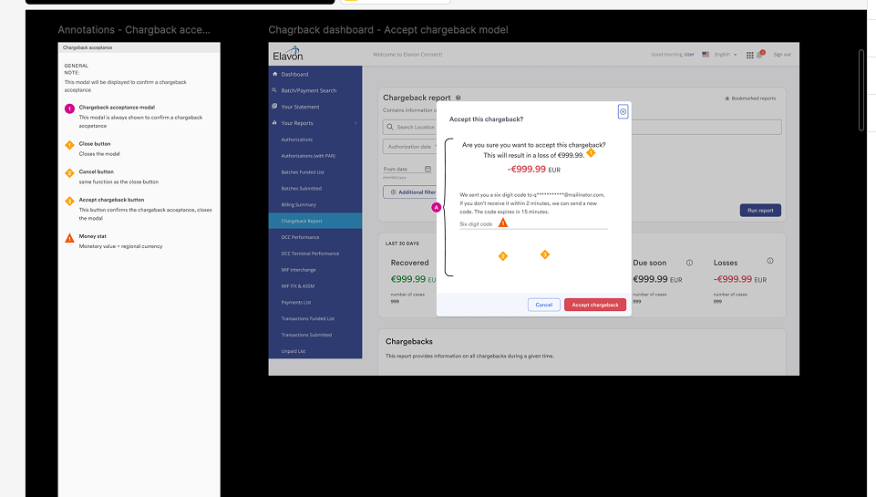
- Contextual Awareness: Designed a layered information model — from row to detail panel to modal — that aligned with user decision-making flow.
- Visual Clarity: Refined status indicators for better scanability and distinct visual roles (no more chip/button confusion).
Rework, redesign
Inspiration for transformation
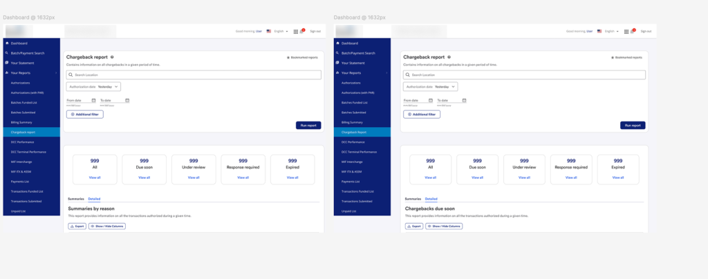
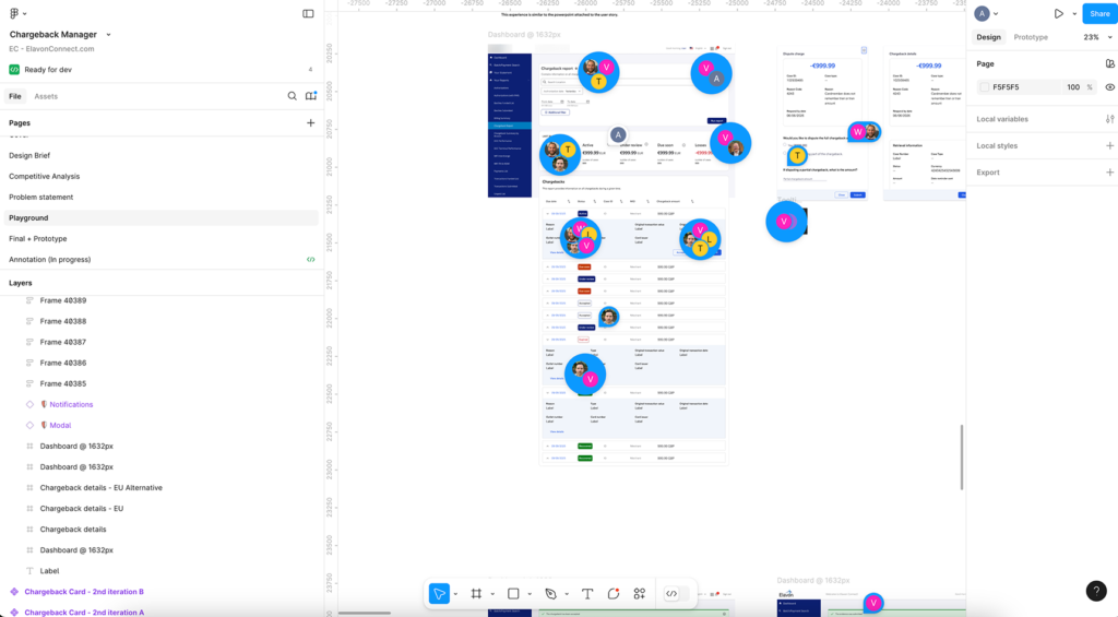
We began exploring design exemplars of effective chargeback dashboard layouts. We sought examples that featured organized structures, conveyed information clearly, and maintained situational awareness for users.


New layout
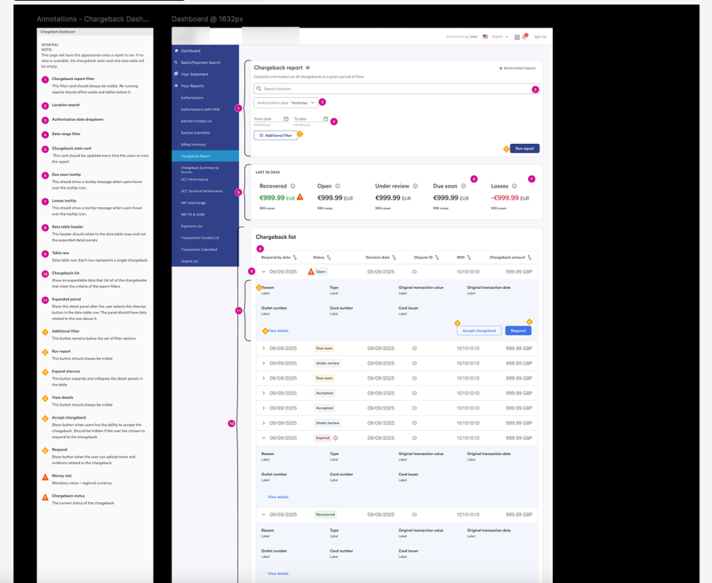
“In the first draft of our full redesign, we reduced the number of tables to one. This nested table featured primary rows that could expand to reveal a detailed panel cell. The primary row displayed the most critical data points for a chargeback, while secondary data points were located within the detail panel. If users required additional information, they could open a modal containing all the data points for that specific chargeback.
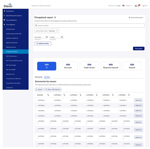
Final design
The final designs were enhanced by modifying the visual affordance of the status chips. In previous iterations, we consistently received feedback that the chips closely resembled buttons. Additionally, the visual hierarchy of the status components in the detail panels was refined to improve scanability.
UX Analytics strategy
- Dispute rates: there’s increased engagement with the chargeback dispute flow
- Dispute error rates: User mistakes contributed by the UI should be reduced
- Duplicate disputes: Duplicate disputes should be reduced to zero
- Expanded detail views usage: increased usage of the new expanded detail views
Outcome
- Delivered a clear, actionable user experience that supports proactive chargeback management.
- Empower merchants to make informed decisions, reducing passive acceptance rates.
- Maintained developer efficiency by utilizing our design system.
- Gained stronger buy-in from stakeholders/product team with a design that balanced business goals and user needs.