The Situation
Elavon Connect (EC) is a payment reporting application that supports merchants in Europe. Available in multiple countries and languages, EC has grown significantly, leading to increased support needs. The Help Centre is currently split into two separate experiences: an internal and an external component. Both components are built with similar patterns but offer different content.
Current experience
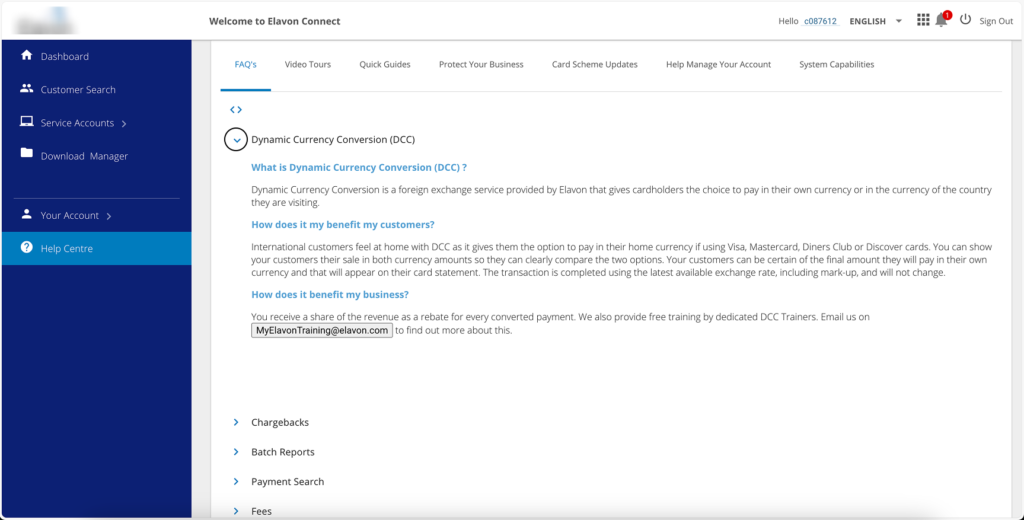
Challenges Faced by the help center
As EC expanded to more countries, customers found it increasingly difficult to use the support sites. The primary issue was that the sites only supported changing the language, without offering region-specific content. For instance, while English became a common language in Europe, English-speaking users still needed access to articles and information tailored to their region, as banking practices vary.
Another challenge was searchability. The current layout and patterns relied heavily on tabs and accordion structures for navigating content. While this might suffice for small amounts of content, it didn’t scale well for the experience the EX team aimed to provide. Consolidating the support sites into one would offer users a single source of truth. Additionally, the Help Centre needed to adopt patterns that aligned more closely with industry standards. Banks and Point-of-Sale companies often share similar patterns in the structure of their support sites.

Discovery phase activities
We started our discovery phase by performing three key activities: a competitive analysis, a “Jobs to Be Done” (JBD) exercise, and ideating information architecture.
The goal of the Jobs to Be Done (JBD) exercise is to identify why users would want to use a product. The JBD is similar to a mini-resume; it helps highlight the value proposition of a product or application.

Competitive Analysis helped identify common patterns found in other support sites. We included support sites from similar companies, as well as support sites that use our design system, such as our parent company U.S. Bank and our sister application Talech.


Lastly, we began looking at a new IA/Site map. This was the starting point for transitioning into our design phase. This not only aided our design process, but also provided the product team with a clear vision of our North Star. The product team wanted to ensure that we had validated features in mind.

Design Phase: blocking out designs
The next step in our design phase was blocking out designs based on the common features identified in our competitive analysis.

First iterations
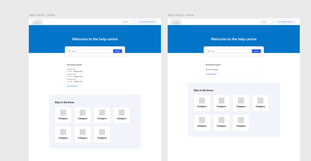
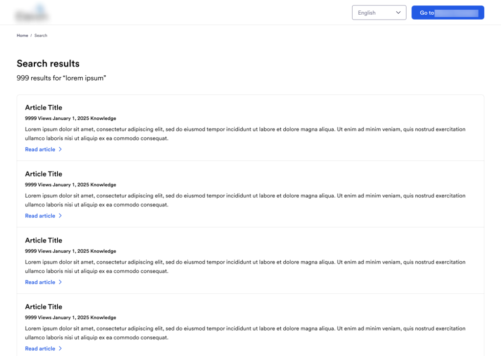
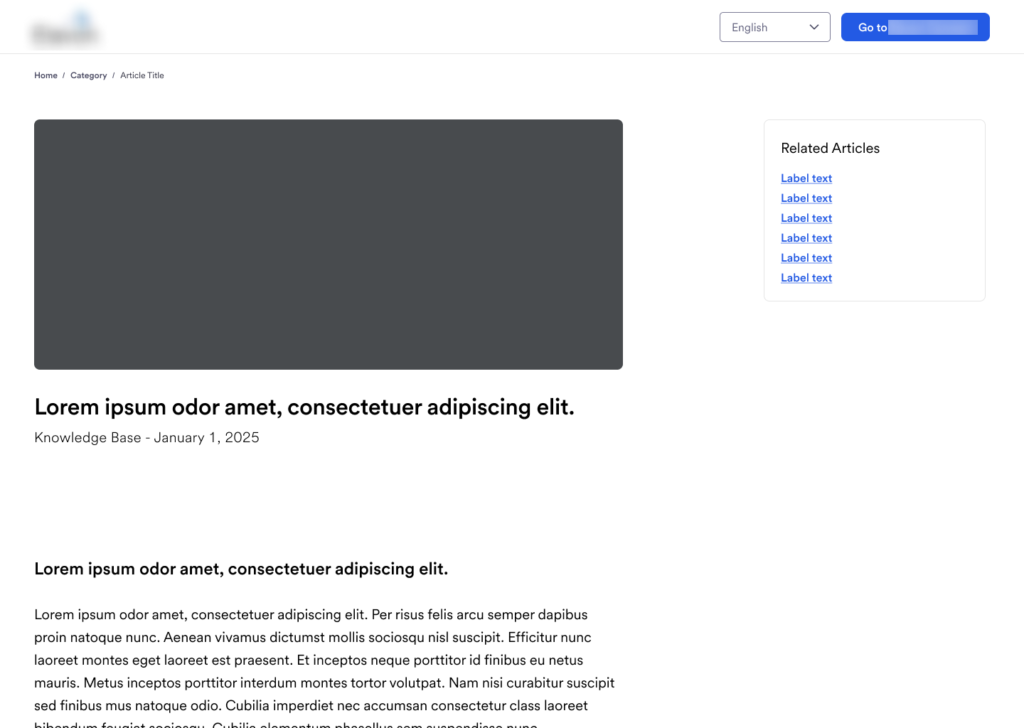
We then began creating the first iteration of designs, focusing on the main template pages needed to achieve at least parity with the experiences found on other sites. We aimed to keep the designs simple so that we could re-use most of the home-brewed content management system we currently have, until we can move to something more flexible and customizable like Salesforce.

With the Product team and my immediate design team satisfied with the templates, we began creating designs to illustrate the different phases of progression. This included showing authenticated experiences and filter enhancements.
Receiving feedback
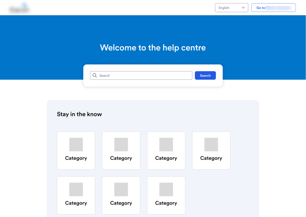
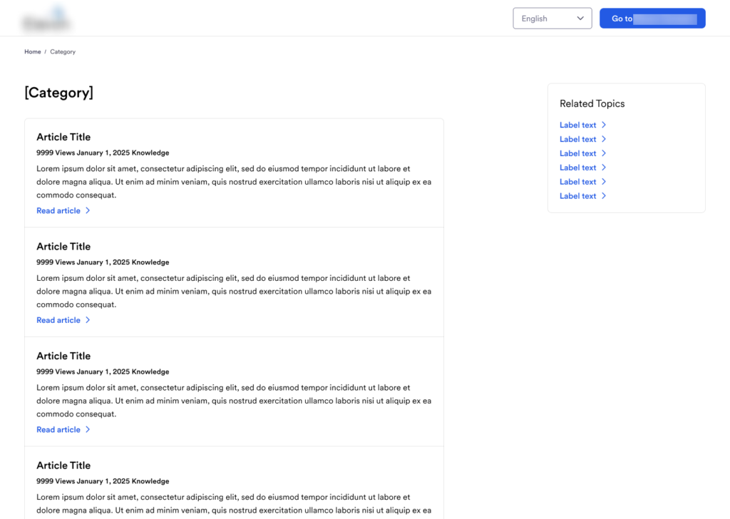
We have begun to receive feedback from the broader design community, known as the business segment. Their feedback helped tighten up the visuals and spacing.

Second Iteration
Expected results
Unfortunately, we were unable to conduct usability testing on the wireframes or prototypes. However, once implemented, we plan to track the following metrics:
Search String Trends
By monitoring search trends, we can identify opportunities to improve our information architecture (IA). This includes reorganizing the article order on the homepage, creating or modifying categories, and addressing gaps in our knowledge base with new content.
Search Activity
We primarily measure the success of the search experience through search activity. Successful searches should result in an article click. If searches end at the results page, it suggests users are not finding relevant articles to meet their needs. This provides our customer service team with an opportunity to evaluate how to display the correct articles or determine if a new resource should be created to address emerging needs.
Article Helpfulness
Each article and resource in the template will include a small feedback card asking if the content was helpful or not. Articles with low scores (e.g., a 40% helpfulness rating) will be re-evaluated to identify sources of confusion and improve the content to better serve users.
To be continued…
This project is still progressing, please return for updates. Thank you