Leaders at ADP wanted a simplified profile experience. Unfortunately, many profiles, such as employment and payroll, were housed in different sections of WFN. These profiles also had their domain-specific product teams. In this initiative, domain teams collaborated on a new cohesive profile experience.
Problem
To work on one employee, HR practitioners, and team managers would have to navigate to various pages in WFN to see profile information. Getting a holistic view of an employee was difficult. Users wanted to have all profiles in a shared location.
Main Goals
- Create a consistent look and feel across the profile tabs
- Identify potential shared patterns, come to an agreement on how to use these patterns
- Explore ways to reduce profile scrolling, when it comes to implementing the new design system
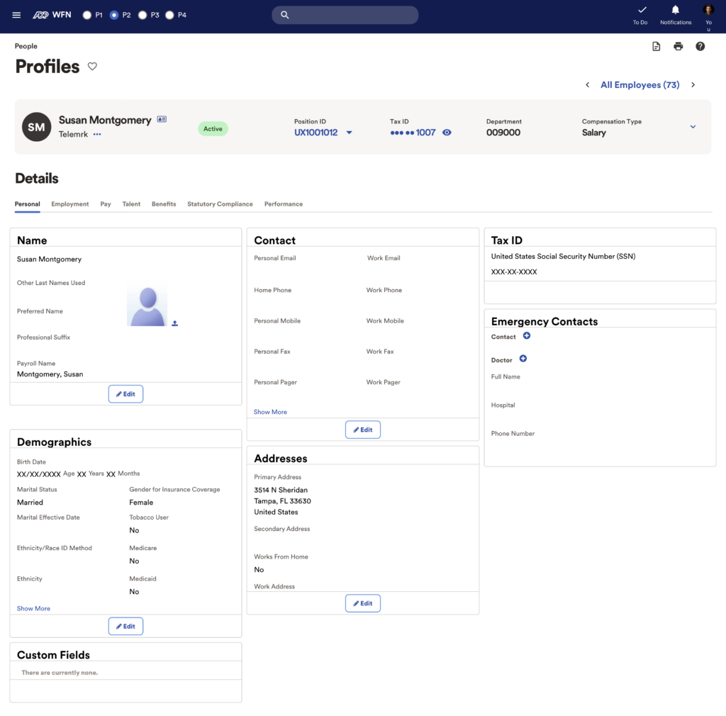
This is the current production state of the unified profile for WFN. The first step was to get all the profiles in a shared location.
In the first iteration, we just cleaned up that cards to be in line with the new design system.
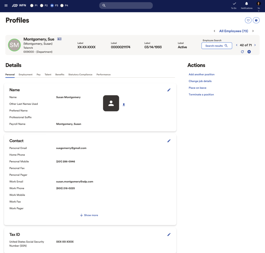
In this 2nd iteration, we decided to create a solution that would reduce the amount of scrolling a user had to perform. Data fields were groups based on relation. Up to 10 data fields would be visible on each card; any extra would be displayed once a user clicked “show all.” After putting this design through user testing, we learned that we had an even bigger problem, data field discovery. Users were unable to find specific data fields because the groupings were not intuitive. In general, users preferred more scrolling over more clicking.
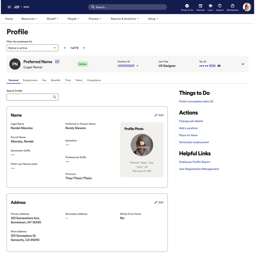
This is the latest screen. We decided to return to a multi-card experience after receiving recommendation from UX research and UX writing