The objective of the employee profile guidance document is to help align designers on shared patterns and components. Sharing these patterns helps them become reinforced throughout the profile experience as well as across platforms.
Problem
Now that domain profiles live in a shared location, there is a growing concern that the profiles feel too dissimilar. ADP leadership wanted to see a more cohesive experience. The profiles feel like they are designed by multiple when it should feel like it’s one designer. Designers are struggling to create these experiences because design decisions on patterns are silos within their teams.
Main Goals
- Document all shared patterns and components
- Make it accessible to UX designers, UX Writers, and developers connected to employee profile projects
- Created a guidance document that would be platform-agnostic, so that it’s useful to all ADP platforms
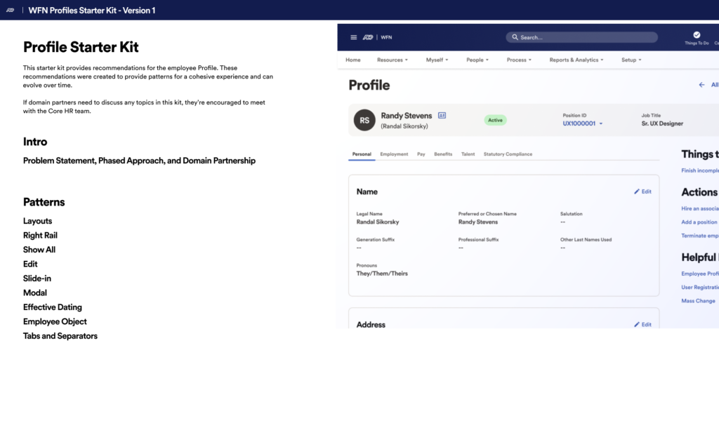
This page is the starter page. Versions of this document were created in Figma. With Figma, we made the documentation accessible to all product team members with a Figma account. The main purpose of this document is to be a record, a record of all the agreed-upon components and patterns for a cohesive profile experience.
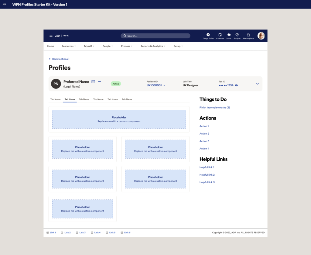
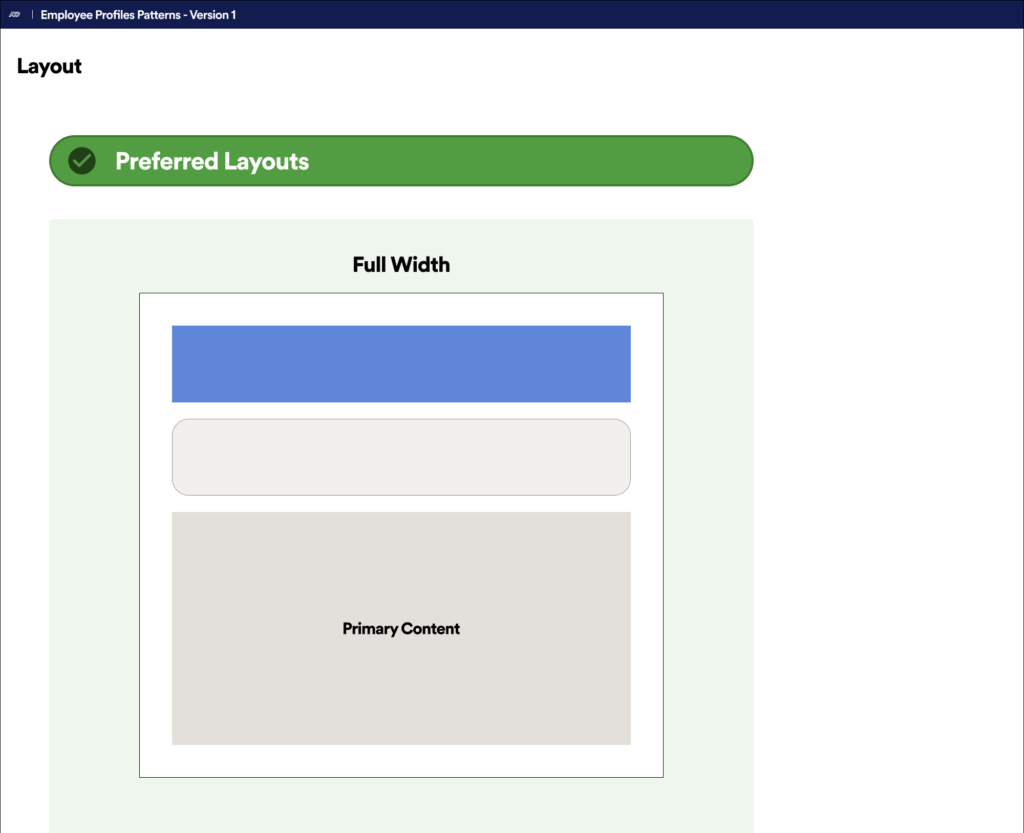
We offered interactive layout examples that designers could copy and paste into their sigma files to speed up their design process.
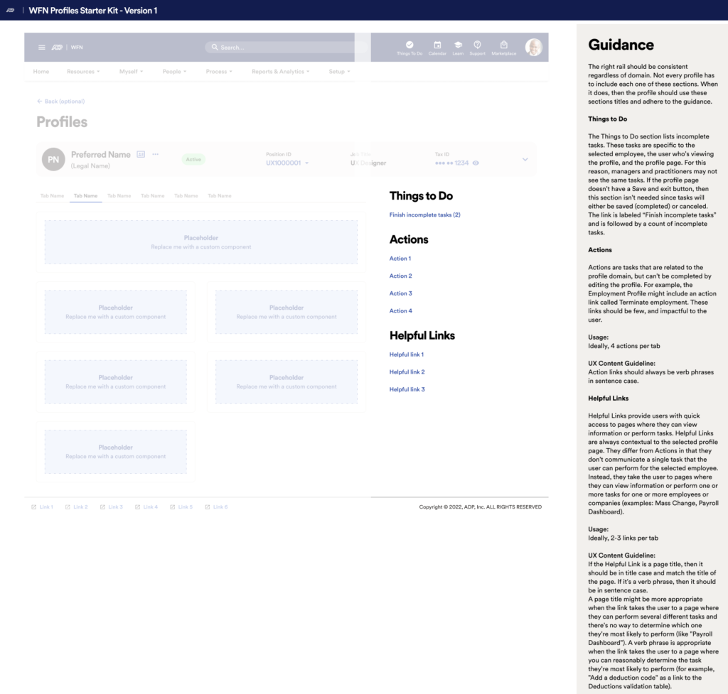
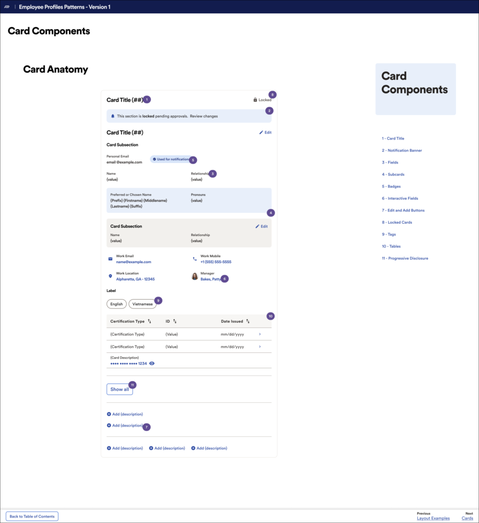
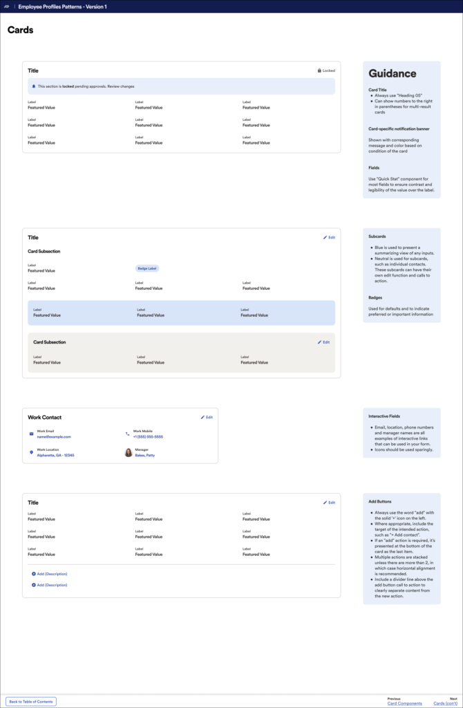
This screen highlights a big concern our director had. Many of the pages in the guidance document felt far too prescriptive. He wanted us to push for recommendations, but to stay clear from giving specific directions. Being too prescriptive would have put far too much responsibility on our team.
We are not subject-matter experts (SMEs) for other domains and should not put ourselves in that position.
The guidance content has been reduced since receiving that critique.